Best Color Combinations for a Modern Living Room invite you to explore the art of color in our living spaces. The right colors can transform a room, making it feel vibrant and welcoming or calm and serene. Understanding color theory and how different shades interact can help you create a beautiful modern living room that reflects your personality and style.
From the significance of color theory to the powerful effects colors have on our mood, this guide will delve into popular trends, the roles of neutrals, and how to use accent colors effectively. We will also discuss how textures, lighting, and cultural influences can shape your color choices, allowing you to craft a living room that is uniquely yours.


Color Theory Basics
Source: pressablecdn.com
Color theory serves as the foundation for creating harmonious and aesthetically pleasing interior spaces. Understanding the principles of color can significantly enhance the mood and atmosphere of a modern living room, guiding homeowners and designers alike in making informed choices that resonate with their personal style and emotional needs.Colors have profound psychological effects that can influence our feelings and behaviors.
For instance, warm colors like reds and oranges tend to evoke feelings of warmth and comfort, while cool colors such as blues and greens promote calmness and relaxation. By mastering color theory, one can strategically select hues that not only reflect their personality but also establish the desired ambiance in their living space.
Understanding the Color Wheel
The color wheel is an essential tool in color theory, illustrating the relationships between different colors. It consists of primary, secondary, and tertiary colors, each playing a unique role in interior design.
- Primary Colors: These are the building blocks of all other colors. The primary colors are red, blue, and yellow. They cannot be created by mixing other colors together.
- Secondary Colors: Formed by mixing two primary colors, secondary colors include green (blue + yellow), orange (red + yellow), and purple (red + blue). These colors add vibrancy and depth to a palette.
- Tertiary Colors: Created by mixing a primary color with a secondary color, tertiary colors include hues like yellow-green, blue-green, and red-orange. These colors offer nuanced shades that can enrich the overall design.
The interplay of these colors helps in creating contrast and harmony within a living room. For example, a room dominated by cool blues can be invigorated with accents of warm orange or rich yellow, creating a balanced and inviting environment.
“The right combination of colors transforms a space from ordinary to extraordinary.”
Incorporating the principles of color theory into your design choices can lead to a cohesive and thoughtfully curated living space, enhancing both the aesthetic appeal and emotional comfort of your home.
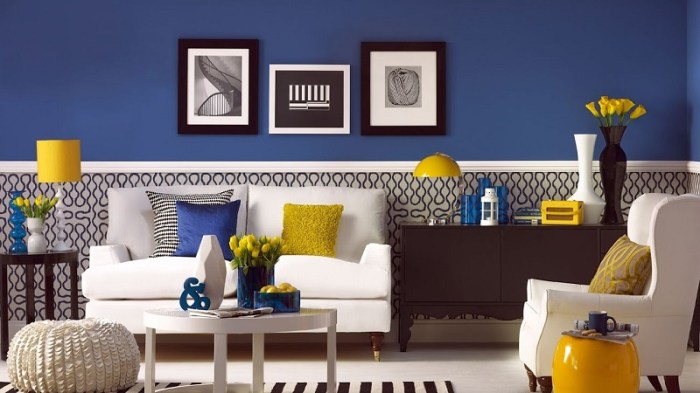
Popular Color Combinations
Source: fujuindustry.com
Modern living rooms thrive on vibrant hues that reflect personal style and contemporary design. Color combinations play a pivotal role in establishing the mood and aesthetic appeal of these spaces. By carefully selecting the right colors, one can create an inviting atmosphere that resonates with warmth and sophistication.Trending color combinations for modern living rooms include a variety of schemes that enhance both comfort and style.
Monochromatic schemes, which utilize different shades of a single color, offer a sleek and cohesive look. Analogous schemes, featuring colors that sit next to each other on the color wheel, create harmony and subtlety. Complementary color schemes, on the other hand, employ opposing colors to create dynamic and eye-catching contrasts.
Examples of Color Schemes
Exploring different color schemes can provide valuable insights into how to enhance a living room’s visual appeal. Here are examples of each type of scheme:
- Monochromatic: Shades of gray paired with accents of charcoal and slate lend an air of elegance and modernity.
- Analogous: A combination of blue, teal, and green brings a refreshing and tranquil vibe to the space.
- Complementary: Pairing orange with blue creates a vibrant energy, adding warmth and excitement to the room.
To better understand the benefits of each color combination, consider the following table outlining their aesthetic contributions:
| Color Scheme | Benefits |
|---|---|
| Monochromatic | Creates a sense of unity and sophistication; easy to accessorize with diverse textures. |
| Analogous | Provides a calming atmosphere; encourages a natural flow between colors and elements. |
| Complementary | Enhances visual interest; draws attention to focal points while providing balance. |
Using color thoughtfully can transform a living room into a personal sanctuary filled with warmth and inspiration.
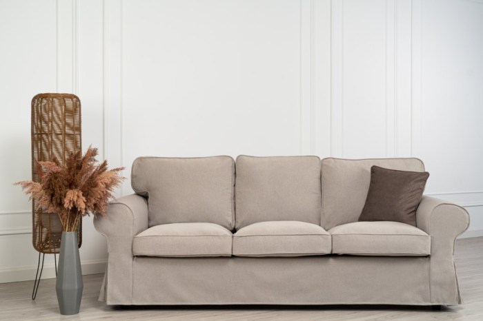
Neutrals in Modern Design
Neutral colors play a pivotal role in establishing an elegant and serene environment in modern living rooms. These hues serve as the backdrop that enhances the overall aesthetics while allowing other design elements to shine. By incorporating neutral colors, one creates a versatile canvas that can adapt to various styles and personal tastes.In modern design, whites, greys, and beiges are essential for cultivating a sophisticated look.
Whites bring a sense of airiness and brightness, making spaces feel larger and more open. Greys provide a contemporary touch, acting as a bridge between stark whites and warmer tones. Beiges add warmth and comfort, creating a welcoming atmosphere. When used thoughtfully, these colors can harmonize with furniture, textures, and accessories, resulting in a cohesive and balanced living space.
Popular Neutral Color Pairings and Their Visual Impact
Utilizing neutral colors in combinations can amplify the elegance of a modern living room. Below is a list of popular neutral pairings and their visual effects, demonstrating how these combinations can transform a space:
- White and Soft Grey: This pairing exudes freshness and tranquility, making a space feel airy. The contrast creates depth while maintaining a light atmosphere.
- Beige and Cream: Together, these colors evoke warmth and comfort. They are perfect for creating a cozy, inviting environment that feels both modern and timeless.
- Charcoal Grey and Light Beige: This combination introduces sophistication and elegance. The darker grey adds drama while the light beige softens the overall look, preventing it from feeling too heavy.
- Warm Taupe and Crisp White: This pairing strikes a balance between warmth and coolness, ideal for a contemporary space. It allows for versatility in decor and furniture choices.
- Greige (Grey and Beige) and Pale Blue: Greige serves as a neutral foundation, while pale blue injects a hint of color. This combination creates a serene and calm environment, perfect for relaxation.
“Neutral colors provide the perfect balance, allowing personal style to flourish while maintaining a sophisticated backdrop.”
Accent Colors
Accent colors play a pivotal role in enhancing the aesthetic of a modern living room. They allow you to introduce vibrancy and character without overwhelming the space. By strategically selecting and applying these colors, you can create a focal point that draws the eye and complements the overall design.Choosing the right accent colors involves understanding the dominant shades in your living room and selecting colors that either contrast or harmonize with them.
Consider the mood you wish to create; warm accents can bring energy and coziness, while cool accents contribute to a calm, serene atmosphere. Balance is key—accent colors should enhance, not compete with, the main colors in your space.
Methods for Selecting Complementary Accent Colors
When it comes to choosing accent colors, consider these methods that ensure a cohesive look:
Color Wheel Utilization
Use a color wheel to find complementary or analogous colors that pair well with your main shades. Complementary colors sit opposite each other on the wheel and can create dynamic contrasts, while analogous colors are next to each other and provide a more harmonious effect.
Nature Inspiration
Look to nature for inspiration. Observe how colors occur in the environment, such as the hues of flowers against green leaves or a sunset blending into the sky. This can guide your choice of accent colors that feel natural and pleasing.
Fabric and Texture Samples
Consider fabric swatches for upholstery or cushions. Sometimes the texture of a fabric can influence your perception of color. Selecting a vibrant fabric can help identify the best accent colors that will work with it.
Mood Boards
Create a mood board with samples of colors, materials, and textures. This visual aid helps assess how accent colors interact with your main colors and the overall theme of the living room.To assist in your color selection, here is a list of vibrant accent colors along with their ideal pairings that can elevate your modern living room:
- Coral: Pairs beautifully with teal or muted gray for a fresh look.
- Mustard Yellow: Complements navy blue or charcoal, adding warmth and depth.
- Burnt Orange: Works well with soft greens or creams, perfect for a cozy feel.
- Turquoise: Matches nicely with earthy browns or sandy beiges for a natural vibe.
- Purple: Enhances soft yellows or grays, creating a sophisticated contrast.
- Fuchsia: Vibrates well with muted tones like olive green or soft blues, adding pops of excitement.
By carefully selecting accent colors, you can transform your modern living room into a dynamic space that reflects your personal style and enhances the overall ambiance.
Textures and Patterns
In modern living rooms, the role of textures and patterns is vital in shaping the overall aesthetic and ambiance. They go beyond mere decoration; they influence how colors are perceived and experienced within a space. The interplay of textures and patterns can either enhance or soften color effects, creating a dynamic and inviting environment.
Different textures and patterns can evoke varied emotional responses and can significantly alter the perception of color in a room. For instance, a smooth, glossy surface reflects light differently than a rough, matte finish, which can change the way a color appears. Textiles, wallpapers, and finishes not only contribute to the color palette but also add depth and interest to the room’s design.
Incorporating these elements thoughtfully can create a harmonious balance between color and texture.
Incorporating Textiles, Wallpapers, and Finishes
When integrating textures and patterns into your color scheme, it’s essential to choose elements that complement rather than clash with your selected colors. Below are effective methods to achieve a cohesive design:
Layering Textiles
Using throws, cushions, and rugs can create a multi-dimensional feel. For example, pairing a deep blue couch with a lighter denim throw and patterned cushions in complementary colors can enhance visual interest while keeping the palette unified.
Textured Wallpapers
Opting for wallpapers with subtle patterns or textures can add depth to an otherwise flat wall. A soft linen wallpaper in a neutral tone can introduce warmth and intimacy to a modern living room without overwhelming the space.
Finishes on Surfaces
The choice of finishes on furniture and decor items can dramatically influence how colors are perceived. A matte finish often softens colors, while a glossy finish can amplify vibrancy. For instance, a matte charcoal coffee table paired with glossy white decor can create an engaging contrast.
Accent Pieces
Introducing accent pieces like metallic or glass elements can reflect light and enhance the overall color scheme. A brass lamp can add a warm glow, making surrounding colors appear richer and more inviting.
Layering different textures creates a tapestry of experiences, allowing colors to interact and resonate in unique ways.
For example, consider a modern living room designed with a muted color palette of greys and whites. Incorporating a plush, textured grey area rug, smooth white leather sofas, and patterned throw pillows with hints of color can create a sophisticated yet warm environment. Adding a wall with a subtle geometric wallpaper can enhance the color play, making the room feel more dynamic and engaging.
By thoughtfully integrating textiles, wallpapers, and finishes, you can elevate the visual appeal of your modern living room, ensuring that colors are not only seen but felt in a deeper, more impactful way.
Lighting Considerations
The interplay of light and color is fundamental in crafting a captivating modern living room. Both natural and artificial lighting can dramatically alter the perception of color, influencing the ambiance and overall design. Understanding how different types of lighting interact with your chosen color palette can enhance the beauty of any space and create a more inviting environment.Natural light, with its changing qualities throughout the day, can bring out the true colors of your decor.
In contrast, artificial lighting can create warmth or coolness, impacting the mood of your living space. It’s crucial to consider both types of lighting when selecting color combinations. The right light can turn a dull shade into a vibrant hue, while poor lighting can make even the most stunning colors appear lackluster or unappealing.
Effects of Light Temperature on Room Colors
Light temperature, measured in Kelvins (K), plays a significant role in how colors are perceived. Different light temperatures can either complement or clash with your chosen color scheme. Below is a table illustrating the impact of various light temperatures on room colors:
| Light Temperature (K) | Color Effect | Best Color Combinations |
|---|---|---|
| 2700K – 3000K | Warm, cozy glow | Warm neutrals, earthy tones, rich colors like burgundy and deep greens |
| 3500K – 4100K | Neutral white light | Bold colors, cool hues, and balanced combinations |
| 5000K – 6500K | Cool, daylight-like brightness | Bright whites, blues, and vibrant colors |
The choice of light temperature can influence how colors are perceived, affecting the mood and functionality of your living room. For a warm and inviting atmosphere, opt for lower Kelvin temperatures. If you desire a vibrant and energizing space, higher Kelvin temperatures are ideal.
“The right lighting is essential for showcasing your color choices in the best possible way.”
Combining natural light with well-placed artificial lighting can enhance the aesthetic appeal of your living room. Consider using dimmable fixtures, accent lights, and a mix of warm and cool light sources to create depth and interest.
Cultural Influences on Color Choices
Source: homeyplans.com
Color is more than just a visual experience; it is deeply intertwined with cultural identity and personal expression. In living room design, the colors chosen can reflect an individual’s heritage, values, and emotional connections. Different cultures have unique interpretations of colors, leading to diverse preferences that shape the aesthetics of modern living spaces.Cultural backgrounds significantly influence color preferences in living room design.
For instance, in Asian cultures, red symbolizes good fortune and joy, often being used in living spaces to invite prosperity. In contrast, Scandinavian design tends to favor muted tones like soft grays and whites, reflecting the natural landscapes and a minimalist approach to life. This diversity highlights how culture can dictate not only the colors chosen but also the emotional and psychological effects they evoke in a space.
Traditional and Contemporary Color Choices Across Different Cultures
The distinction between traditional and contemporary color choices reveals fascinating insights into how cultures evolve and adapt. Traditional color palettes often draw from historical influences and natural surroundings, while contemporary choices tend to reflect modern values, technological influences, and global trends. In Mediterranean cultures, traditional living room colors often include earthy tones such as terracotta and deep blues, inspired by the landscapes and architecture.
Meanwhile, contemporary Mediterranean designs may incorporate brighter, bolder colors to create a lively atmosphere. In contrast, Indigenous cultures in North America may use traditional colors derived from nature—like deep greens and browns—while contemporary interpretations might introduce vibrant colors in abstract patterns, reflecting a blend of old and new.
Global Design Trends and Local Color Selections
Global design trends have a profound impact on local color selections, merging influences and reshaping preferences. As cultures connect through media, travel, and digital platforms, color trends can transcend geographical boundaries. For example, the rise of minimalism has brought about a preference for neutral palettes, such as whites, beiges, and soft pastels, which are now prevalent in many cultures. This tendency reflects a shared value for simplicity and tranquility in modern living spaces.
Conversely, the eclectic style often seen in urban environments demonstrates the fusion of various cultural color choices. Bright, contrasting colors might be used to celebrate diversity and individuality, showcasing how global interaction can create a rich tapestry of color in local designs.
The interplay of global trends and local traditions creates a unique color language that speaks to both individual and collective identities.
This dynamic relationship between culture and color underscores the importance of understanding one’s heritage while embracing modern influences, creating living spaces that are both personal and reflective of a broader narrative.
Personalization and Customization
Creating a living space that truly reflects who you are involves much more than just choosing trendy colors. It’s about infusing your own personal style into the color palette of your modern living room. Colors evoke emotions and memories, making it essential to select hues that resonate with your personality and lifestyle.Personalization in color choices allows you to transform a house into a home.
Customization can be achieved by considering your unique preferences and how you use your space. Whether you gravitate toward calming neutrals or vibrant bursts of color, tailoring your palette is an expression of your individuality. As such, here are some methods to assess your own color preferences before redesigning your living room:
Assessing Personal Color Preferences
Understanding your own color preferences is a crucial step in creating a cohesive and inviting living space. The following points can help guide your evaluation process:
Reflect on your favorite colors
Think about hues that make you feel happy, relaxed, or inspired. Consider items in your wardrobe or belongings that you are drawn to.
Observe your current environment
Take note of colors in your existing living space. What elements do you enjoy? Which colors might you want to change?
Consider the mood you want to create
Different colors evoke different feelings. Decide if you want your living room to be calming, energizing, or welcoming.
Look to nature
Nature offers a palette that can be both grounding and invigorating. Think about colors found in your surroundings that resonate with you.
Review existing furniture and decor
Your color choices should complement your current furnishings and decor. Consider what colors work well with these items to create harmony.
Explore cultural influences
Personal heritage or experiences can shape your color preferences. Embrace colors that connect you to your roots or travels.
Experiment with samples
Before committing to a color scheme, use sample swatches or digital tools to visualize how different colors will look in your space.
Seek inspiration from various sources
Browse magazines, websites, or social media platforms. Collect images of spaces that inspire you and note the colors that stand out.By engaging with these points, you can create a personalized color scheme that speaks to your heart and enhances the overall atmosphere of your living room.
Outcome Summary
In conclusion, selecting the best color combinations for a modern living room is about more than just aesthetics; it’s about creating a space where you feel at home. By considering color theory, popular trends, and personal preferences, you can design a living room that resonates with your lifestyle and evokes the emotions you desire. Embrace the journey of color and let it bring your living space to life.
FAQ Overview
What are the best colors for a small living room?
Light colors like whites and pastels can make a small living room feel more spacious and airy.
How do I choose an accent color?
Select an accent color that complements your main color scheme while adding a pop of vibrancy.
Can I mix different color schemes?
Yes, mixing color schemes can create a dynamic look, but ensure they harmonize to avoid clashing.
What role does lighting play in color selection?
Lighting affects how colors appear; natural light can enhance brightness, while artificial light can alter tones.
How can I personalize my color choices?
Consider your favorite colors, lifestyle, and the atmosphere you want to create to personalize your choices.